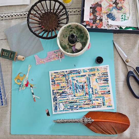
Naoko Fujimoto (NF): Back in 2016, I felt like my creative career was going nowhere. I quit my full-time job when my first poetry chapbook, Home, No Home, came out. Immediately after, Tupelo Press contacted me to visit their residency program at the Massachusetts Museum of Contemporary Art. My life dramatically shifted during this transition, one week after leaving my job. What I clearly remembered was “I have plenty of time.” Therefore, I started translating my poems (that are written in English on flat paper) into words and images to create a contemporary Emaki (picture scroll). This concept of translation guided me to have another idea, “transport.”
So, “trans” is a shortened word of Translate and Transport. I adapted and developed an Emaki (eh-MA-kee), which is a storytelling method used from the seventh to the sixteenth centuries in Japan. It is still a widely recognized art style in the world. Emaki is akin to a current graphic novel/poetry/comic. One of the most famous story adaptations of Emaki is the Tale of Genji by Murasaki Shikibu. My graphic poetry project is also meant for the viewer to transport their senses from the flat paper and bridge the gap between words and images that will connect with their physical counterparts. For example, in a historical Emaki, there are side stories hidden behind some of the main graphic narratives—be they comedic or serious—for audiences to interpret. All of my details (choice of words, materials, or styles) have a specific meaning to contribute to the whole. I love to play with the side story-telling techniques. The following graphic poem is from GLYPH. As you can see, many images and words intertwined.
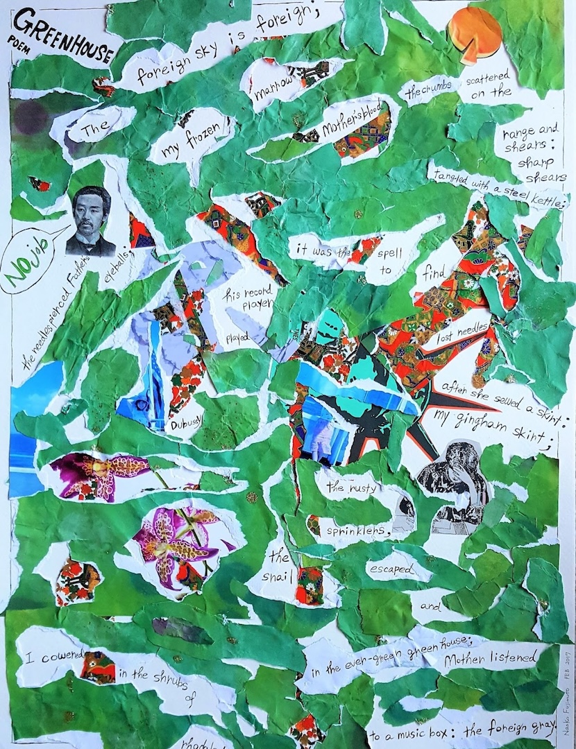
Naoko Fujimoto, graphic poem. Image courtesy of the artist.
You mentioned your dissertation earlier. Could you tell me about your idea, “trans-vocal”? And how does the idea develop into your new projects, such as visual poems with letterpress prints?DP: I think my idea of the “trans” of transvocality overlaps significantly with yours! My idea of transvocality developed out of the translingual works I was reading and the common experience of translingual individuals of existing in a liminal space between languages, one that is rich and generative but not always comfortable. Scholars of translingualism have also interpreted this in a queer context as being transcendent, separate, above, or apart from, (or aside, as you reference beautifully with your mention of “side story”) and I find that interpretation particularly compelling. I saw this “trans” nature as expressed in works that feature multiple languages and ultimately multiple voices, because multilingual people report that their voices in their respective languages are different, and when these different voices come together in literary works, they achieve a kind of “in between” or “separateness” that distinguishes them from monolingual works.
For me this applies to the pairing of visuals with language as well—they are transvocal in the sense that they exist between genres, between “languages,” and are often “apart from” and unclassifiable, particularly in a commercial context. As an example, I’m curious whether you’ve run into challenges with classification and publication of your hybrid work. I’m currently working on a manuscript based on Dante’s Purgatorio that’s extremely visual in that most of the poems are spread across two pages that interact with one another. That has posed some difficulties for publication in journals. Yet I’ve also noticed that a number of translingual poet-translators include visuals and creative typography in their work. I’m thinking here of Anne Carson, Don Mee Choi, Monica de la Torre, and Cecilia Vicuña, all of whose translingual, visual work poses interesting challenges not just for readers but also for classification and publication. I wonder what your experience has been with these. Have you run into challenges bringing your visual poems to audiences?
NF: About finding audiences: When I translated my written poems into graphic poems, I started posting my creative processes—how I compose, choose materials, and show the outcome—on my Facebook account. I shared about seventy graphic poems from winter 2016 to summer 2019. Eventually, I left Facebook, so I do not have an account now. Through the process, I received offers from magazines, online journals, and Tupelo Press. Once I created a handful, I decided to complete a collection as a full-length book, and Tupelo Press supported my process and decisions on story narrative. I am grateful that they keep having me. My new translation book about Japanese waka poems by female authors with visual elements will be available from Tupelo Press in 2026.
Visual poetry is not a new concept, and it is much easier to publish online, and the cost of colored printing is lower than ever. I often receive a question about where to look for publications, but there are many publishers if we look around. Sarabande Books published Sarah J. Sloat's visual poetry books, and Pleiades Press had the Visual Poetry Series, such as Rodney Gomez's book. Rose Metal Press publishes hybrid books and textbooks. Kelcey Ervick and Tom Hart edited "Field Guide to Graphic Literature." These are some examples of visual poetry publishers. In addition, RHINO Poetry published an interview with Monica Ong, who released Planetaria: Visual Poetry (Proxima Vera 2025). This is a truly stunning poetry book.
One of my newest projects is a bilingual essay series. The theme is essentially, “What must I have if poetry is to be an inner practice like religion?—I must have beautiful things,” and I write about things in both English and Japanese. Living with beautiful things is necessary. They are almost like a religious tool, like prayer beads, to make the mind stable. I recently learned about glass necklaces during World War II. When metals were confiscated for equipment, metal accessories were replaced with glass. What I heard about the 1940s from my grandmother was so different from these magnificent beads. Japan experienced two atomic bombs, and I reeled at the sight of glass milk jars melted in the heat wave displayed at the Hiroshima Peace Memorial Museum. I found a beautiful glass necklace from that era, and it is around my neck. It would be personal to decode this meaning in writing, and I am doing so with photography. Photography is my nemesis; however, after I conversed with Robert Lifson, a museum photographer from the Art Institute of Chicago, I decided to become friends with photography. A personal website is a perfect place to play with new elements and skills.
If I want to publish these essays written in both English and Japanese, it may be a niche demand. Therefore, I decided to publish a handful on my website, and eventually, I want to invite writers to talk about their beautiful things in my online community, Working on Gallery. I may be able to make an anthology about the theme, and it is exciting to expand my mind about the project. In addition, I received an opportunity to show this project during this interview!
Some people indeed love supporting multimedia writings, and some may not. One of the reasons I left Facebook was that I received negative comments about graphic poetry, such as “You are allowed to create those works because of English as a second language author” and “You need art to support your English writing.” Music, art, and writing do not have strict borders as I understand them. I have my spectrum that measures the weight of musicality and visuals on writings, like a measurement of sugar and salt in a way. Once I decide on a direction, I keep running without any distractions. So, I think that it is natural for me (writer and translator) to explore any art elements.
DP: Wow, that’s disheartening to hear that readers on Facebook had such a narrow view of your work. In fact, I find it really ironic to suggest that writing in a second language might pose a negative limitation that might require the use of visuals as a crutch, since I’ve often thought that the opposite is true, that many translators turn to visuals because they are liberated by the idea that all language is both limited and porous. I love Monica Ong’s work, some of which was recently featured in Asymptote, and she’s a perfect example of how poetry and graphics expand each other by existing in a transitory, transensory, translative space between genres. I’m actually fascinated with the idea of the volvelle as potentially a kind of interactive visual representation of translation, and I’ve played a bit with creating volvelles as translation machines. Ultimately, my experiments fell short, but I made a simpler version of a paper machine with the pull-and-play piece I featured on your website, which juxtaposed two partial images that could not both appear in their entirety at the same time—one of my father, Arno, and another by Gustave Doré, of Buonconte da Montefeltro lying dead on the banks of the Arno River. For me, this was another metaphor for the way a translation simultaneously evokes and replaces its source.
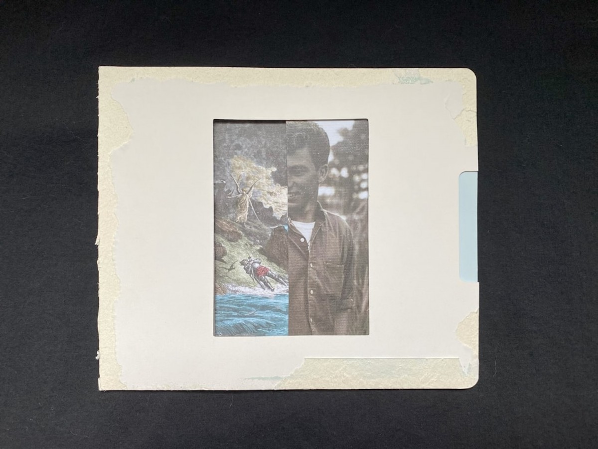
“River : River” No.1, Danielle Pieratti. Image courtesy of the artist.
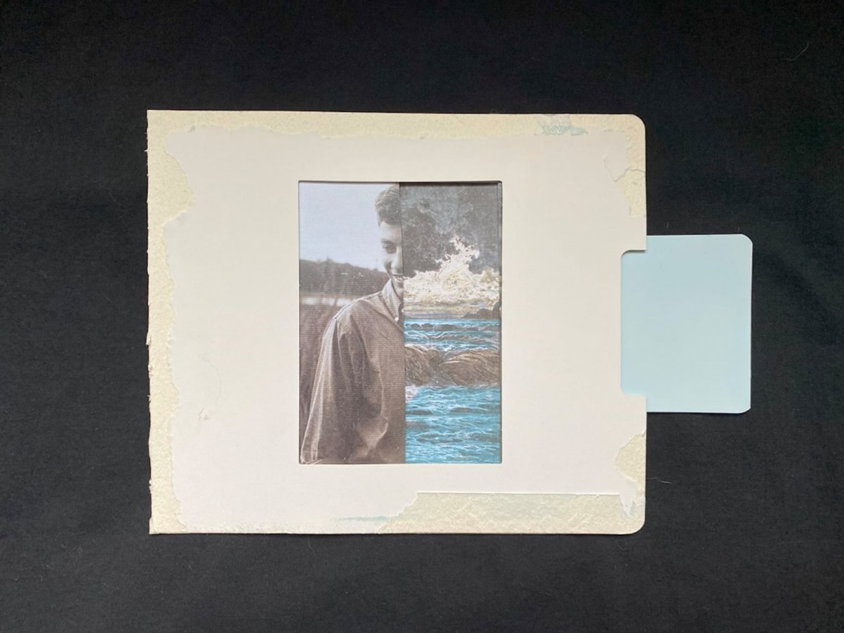
“River : River” No.2, Danielle Pieratti. Image courtesy of the artist.
Your new bilingual essay series is fascinating! I wonder if you could talk a little more about the inspiration for it and for your new book.NF: My new book, of Women, will be forthcoming from Tupelo Press in summer 2026. I translated waka poems by Japanese female poets from the seventh century to the twelfth century, when Japanese women’s literature flourished. Famous writers from the era include Sei Shōnagon (The Pillow Book) and Murasaki Shikibu (The Tale of Genji), and I’ve introduced some lesser-known female poets to this collection. Many Japanese female writers’ names were not documented, even though they actively supported politics and their partners back then. They were commonly referred to as “Someone’s Mother” or “Someone’s Daughter.” The Japanese belonging particle, of (の), is common to describe the female’s name. Waka compacts much information in a short form—words with double meanings, unfamiliar phrases, habits foreign to non-Japanese speakers, and hidden historical backgrounds—so it would be hard to understand these authors’ full intent by simply reading direct translations. Therefore, my project has several approaches to capture the original sensory images.
One of the approaches to translating poems is to have graphic elements, which were added in light of my previous work with “line-break hyperawareness” and my work in GLYPH: Graphic Poetry=Trans. Sensory (Tupelo Press, 2021). My forthcoming book has waka translations with visual elements. It also has historical and educational content along with them. The following two photos are a part of my translation process. I sketched plants written in the original waka poems when I stayed in Kyoto and Nara. I also used all the paper materials from there. Eventually the sketches turned into a final piece. This aesthetic is similar to the side story of graphic poems from GLYPH.
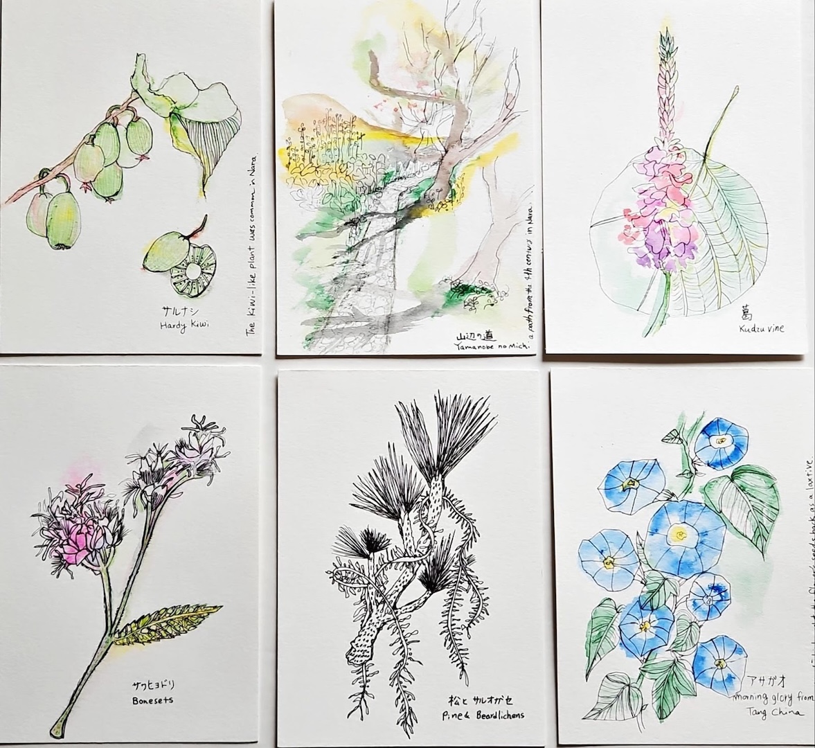
Plant sketches for waka poems with visual elements. Image courtesy of the artist, Naoko Fujimoto.
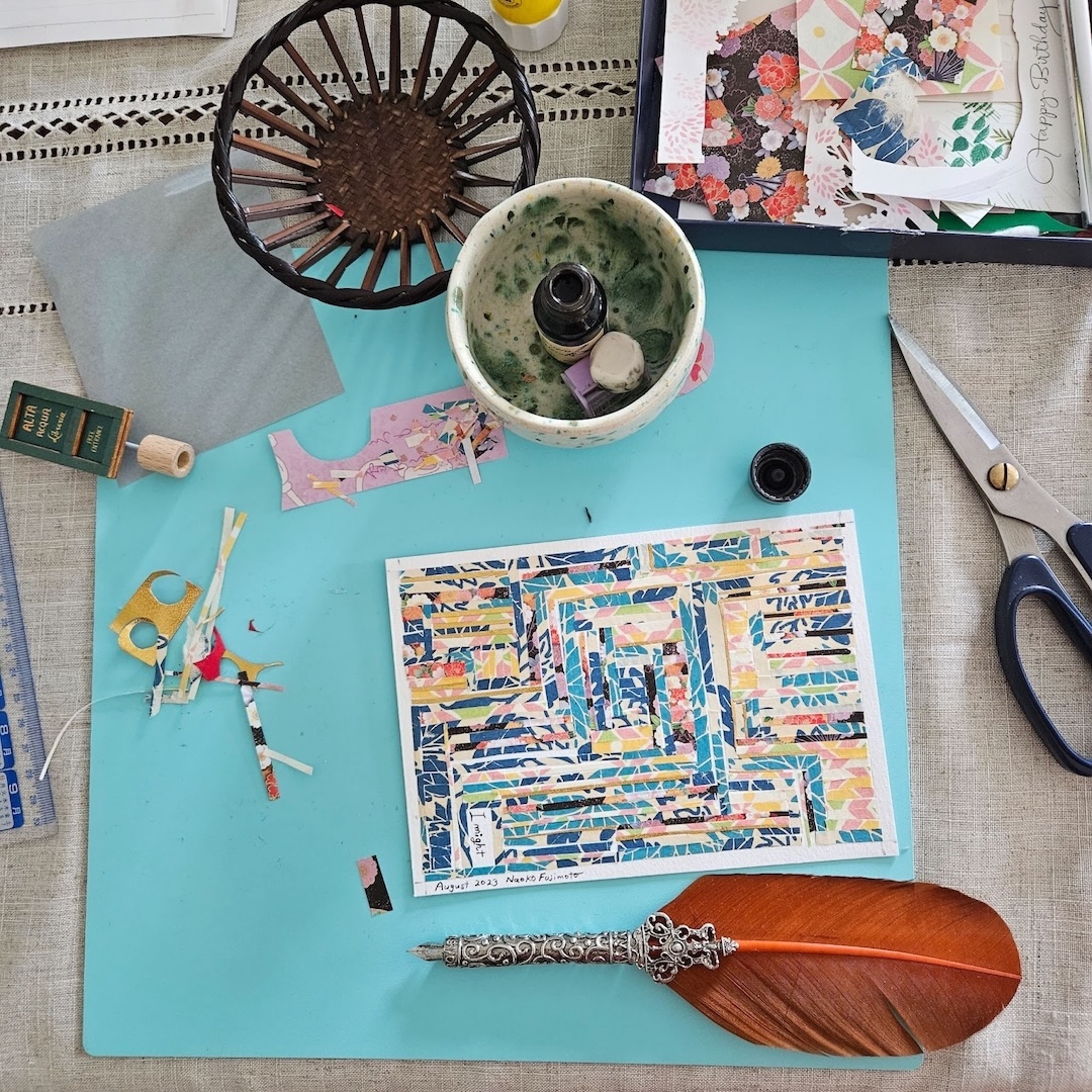
Work in progress. Image courtesy of the artist, Naoko Fujimoto.
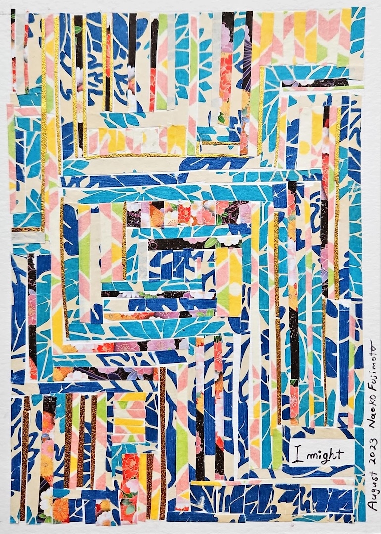
A translation of Sei Shōnagon’s waka (Part 1), originally published in Cable Street. Photo by the artist, Naoko Fujimoto. This piece highlights my idea of “line-break hyperawareness.”
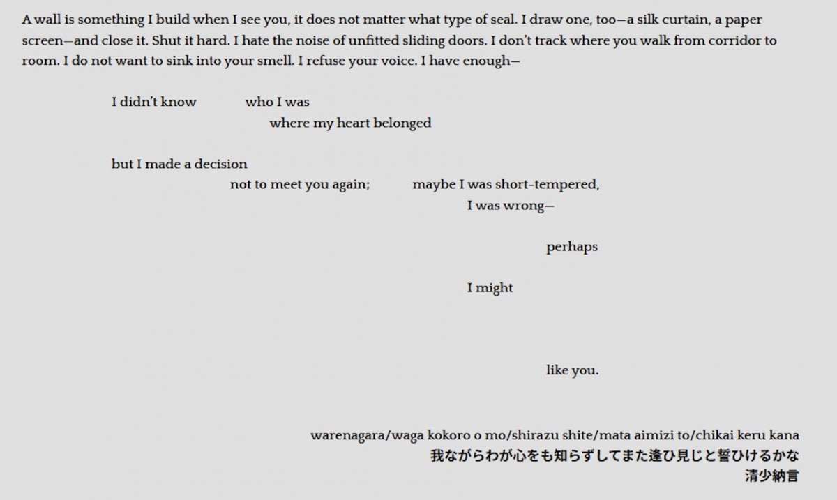
A translation of Sei Shōnagon’s waka (Part 1), originally published in Cable Street. Photo by the artist, Naoko Fujimoto. This piece highlights my idea of “line-break hyperawareness.”
How do you choose materials to create your projects?DP: My current project incorporates visuals that make use of the few humble materials I felt comfortable working with—paper, cardboard, tape, T-shirt yarn, and typography. With each of these I sought to find graphic ways to visualize translation; the last features the most heavily in the manuscript, because I use color to mimic the temporal “fading” of Dante’s original text.
My project seeks to highlight the relationship between the original, canonized text, the variety of the English translations, and my own work, and I especially wanted to elevate the translations themselves as originals. I also wanted to play with the relationship between facing pages in a bilingual text, where the original appears on the left-hand page, and the translation appears on the right. Interestingly, no matter the existing power relationship between the two languages, this convention has the effect of creating a hierarchy between the two that privileges the translated text. (I’m currently reading The Border Simulator, by Gabriel Dozal, which bucks this trend by featuring its Spanish translation on the right.) In my work, I wanted the paratextual material on the left to suggest, at least briefly, that what appeared on the right was a “translation” of the original, challenging definitions of translation as dependent upon linguistic equivalence.
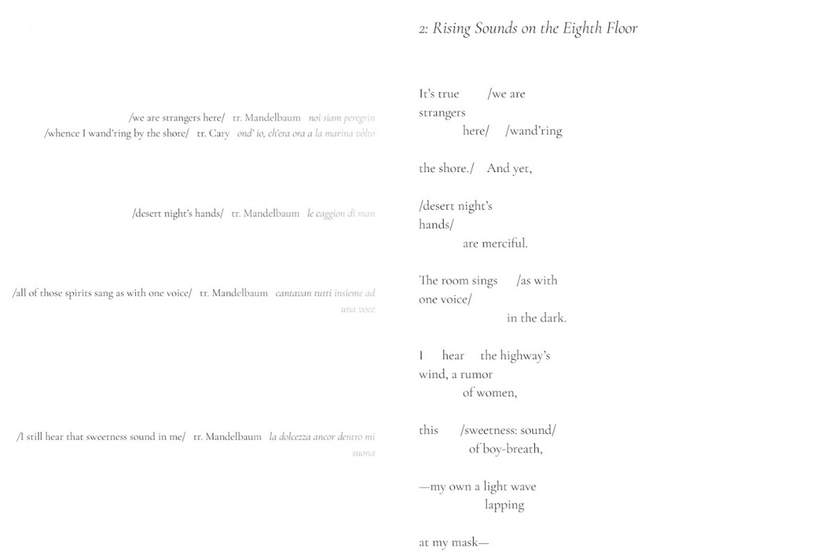
Excerpt from “2: Rising Sounds on the Eighth Floor” by Danielle Pieratti. Originally appeared in AGNI.
I recently began a collaborative letterpress project with artist Anna J. Schwartz and the University of Connecticut’s Counterproof Press. Anna and I met in a creative writing class with Darcie Dennigan at the University of Connecticut, and I was immediately drawn to Anna’s paintings, so I was humbled when she chose to respond to one of my poems with a work on paper visualizing its language and layout. The original version of my two-page poem, “Of Longfellow, of Mandelbaum,” borrowed lines from each of these Dante translators and featured them spread across two columns. Anna’s “feedback” on the two-page poem was a two-page graphic response that mimicked the typography and weight of the original.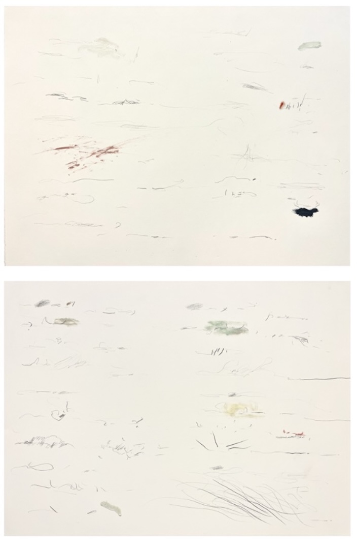
Works on paper by Anna J. Schwartz. Courtesy of the artist.
When we decided to work together, I suggested letterpress mostly because I’d been longing to experiment with movable type, and because I knew Counterproof Press had a long history of collaborating with poets. Anna was curious about experimenting with monotype printing, and we both felt that that medium’s potential for producing subsequent ghost prints and new variations posed an exciting parallel to translation and adaptation. In a monotype, an artist paints on a smooth surface like glass and then overlays paper to produce a one-of-a-kind print. But the glass that remains on the paper can be used to create subsequent “ghost” prints or new, modified prints that build on the original. Our idea was to create a series with multiple modified ghost prints, each featuring letterpress words and phrases from the poems that inspired them.When I wrote the poems, I began with Dante’s text, so in developing this project, we began with the poems—Anna selected text that she was drawn to, and I modified the text to produce fragments that Anna drew upon to create her prints (a process that has been thrillingly recursive!). The final step involves me tweaking the placement of the text to overlay it on the prints, setting the typeface, and finally printing on the letterpress. We’re hoping to be finished sometime this fall.
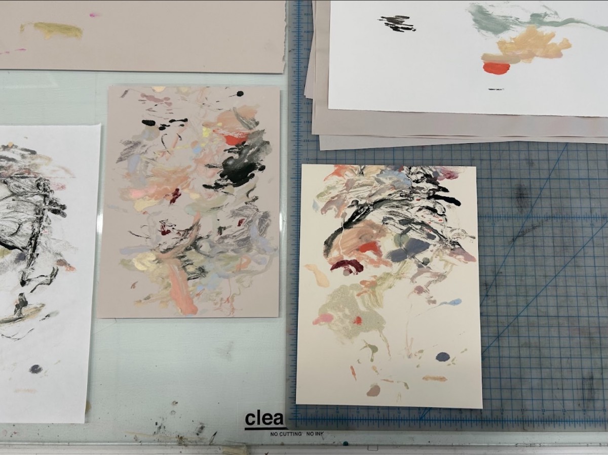
Process photo by Anna J. Schwartz from letterpress project. Courtesy of the artist.
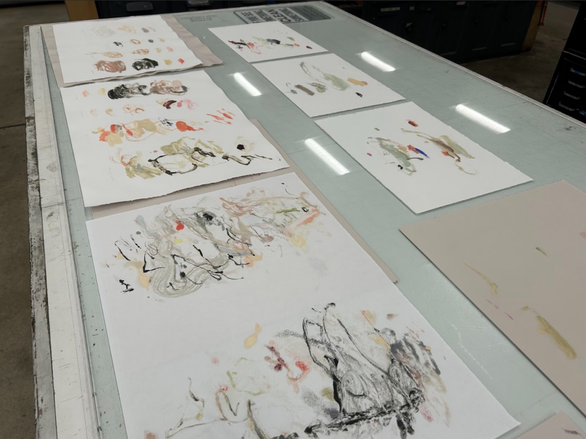
Process photo by Anna J. Schwartz from letterpress project. Courtesy of the artist.
When I consider this project, I can’t help but recognize what a novel and humbling experience working with visuals has been for me. I’ve come to this work with quite a bit of trepidation, acknowledging my inexperience and grateful for those who have encouraged and educated me. Like me, I think you were a writer first before you started working with visual poetics. As a final question, I wonder if you can speak to what gave you the confidence to branch out, and what you might say to other writers who are curious about producing hybrid work?NF: Yes. I am a writer, but there is a vague line. As I mentioned in a previous answer, to me, art forms do not have strict borders. Learning English as a second language is also a part of learning a new culture and expanding my comfort zone since I was a young student. Some people may not like sitting in a box with six walls. Because of this, it has been natural for me to experiment with new outcomes. They stretch out from their familiar territories—maybe that is the reason visual narrative has become more popular than ever. The process of writing words becomes more mature, so writers look for new venues. I will keep exploring what I, as a human, can create. What might I say to other writers who are curious about producing hybrid work? Do it. Be friends with time. There is nothing to worry about with your creative process. It is mundane, but it is true that expressing who you are is the point of it all. When you follow your flow, you will find your community.

