
In 1915, Franz Kafka pleaded with his publisher Kurt Wolff Verlag not to show the beetle on the cover of Metamorphosis. It had to remain unseen. If the cover displayed one illustration of the beetle, Gregor might never be glimpsed or guessed at again through the sheer language of the story.
When a book travels and changes, publishers won’t always present it in quite the same way. And when the translations multiply sometimes you have a series of cover artworks no longer focused on exactly the same thing. Outside the English language there are a great many talented publishers pursuing new designs through collaboration and experimentation rather than borrowing set formulas. In all languages we may now have covers illustrating beetles, but there are hundreds of variations and the details keep changing.
In Spain, Blackie Books continues to publish their authors Ben Brooks, Percival Everett, and Laird Hunt in casewrapped hardbacks. The covers are always brightly illustrated and varied, but each maintains the same house font—a signature for the whole catalogue. Editorial Almadía in Mexico takes this a step further. For ten years now, every cover has been the work of graphic designer Alejandro Magallanes, who has formed a whole series of changing, luminous designs. Their books are active, experimental objects; a figure on the dust jacket will often be at play with the art of the cover beneath. London’s Design Museum nominated several books published by Almadía for its Designs of the Year 2016 award.
However, it is particularly interesting when different worlds meet, which brings me to the impressive collaborations orchestrated by Alceu Chiesorin Nunes with Companhia das Letras in Brazil. Companhia is a large publisher, with seventeen imprints—this year alone, they have already published three hundred titles. But, as its Art Director (or capista) Nunes explains, he is part of a small and devoted team of six designers finalizing all of the covers. Through finding the right outside design collaborators, they can produce an average of thirty-six books per month. As Nunes says: “A lot of ideas come in an intuitive way, sometimes as a result of a lot of experimentation. A certain amount of freedom is maybe because of my Brazilian background, with so much informality. But I think that my best quality is to share authorship and always try to look for the right person for the right project. I know I can always count on my team and our collaborators, who are such a talented group of people. It is impossible without them.”
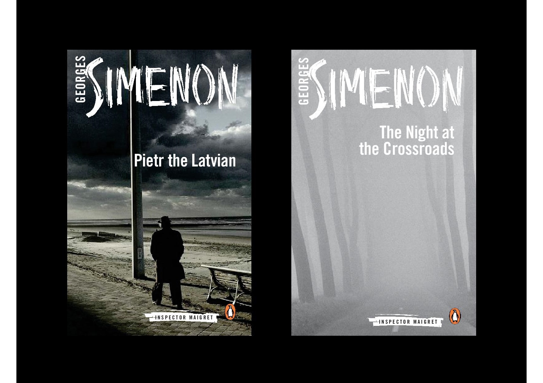
In 2013, Companhia’s publisher Luiz Schwarcz saw an opportunity for collaboration with Penguin: both publishers were preparing their respective translations of Georges Simenon’s Inspector Maigret books in Portuguese and English. Amid frenetic production, Nunes suggested designing hand lettering for the covers using correction tape. Nunes often creates fonts from scratch and this particular device reminded him of hiding the clues, and appears on every one of the editions published in each language to date. To give the covers a sense of place, Nunes wanted to find images of city life in France and Belgium. Peter Galassi at MoMA, a friend of Schwarcz, introduced them to the work of photographer Harry Gruyaert. Nunes said these stark, elusive shots of cityscapes and interiors “fill the project with a contemporary air”, and the design has been recreated nearly forty times for the successful series in translation.
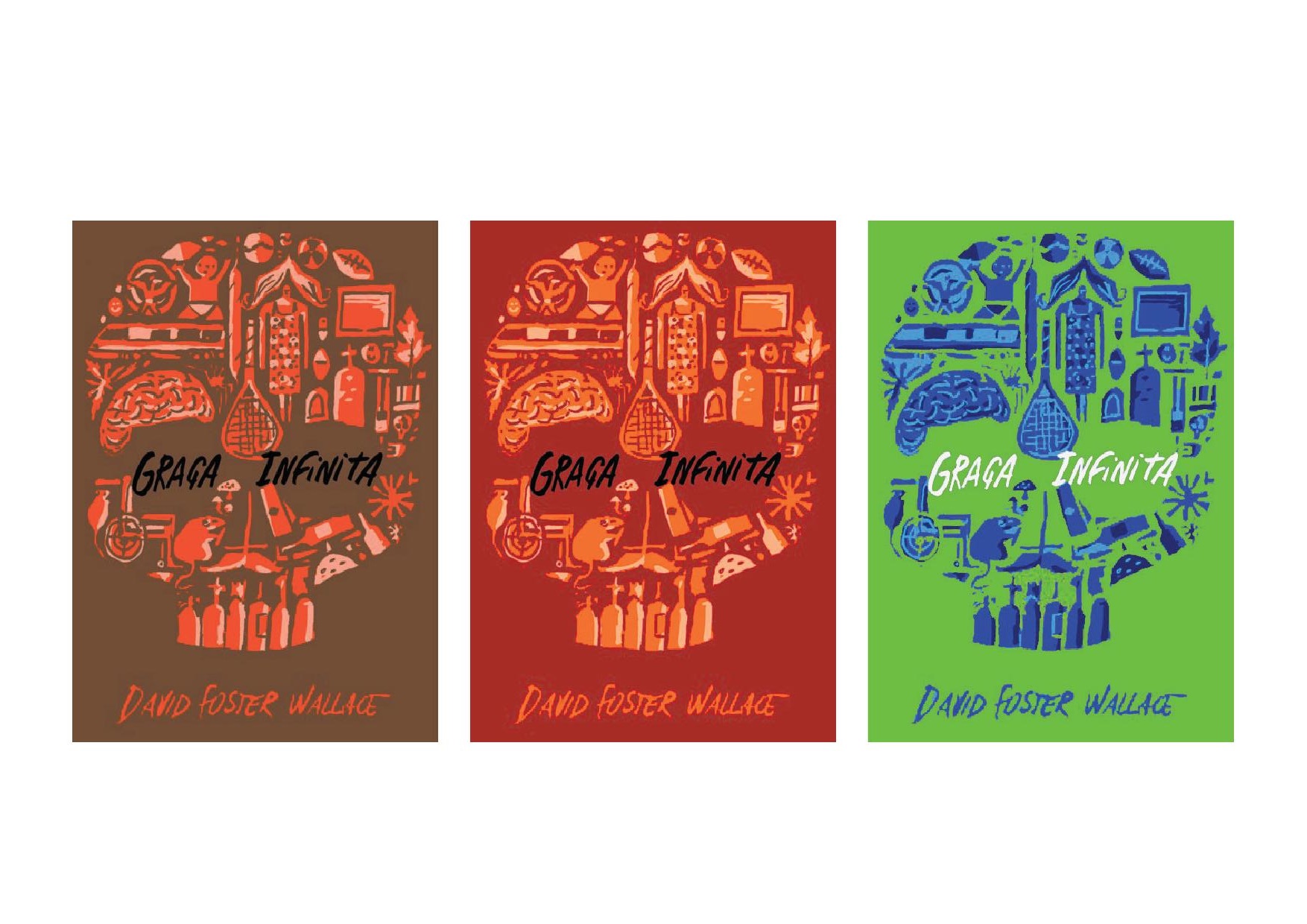
Nunes has gone on to design original artwork for Brazilian and international authors including Daniel Galera, Nicky Hornby, José Saramago, Mia Couto, and Milan Kundera. And in 2014 he began working closely with editor André Conti on the first Portuguese translaton of David Foster Wallace’s Infinite Jest [Graça infinita]. As Nunes says, for this icon of contemporary literature they wanted to do “something remarkable, something to make it seem like a different object.” When illustrator Nik Neves joined the project they began to design a skull composed of many images from the novel, only to find it was not bold enough. After discussion and further sketches, Neves pared the original designs down to one minimalist and haunting image of a skull with videotape eyes (in the novel the characters are transfixed by a film until death). Conti suggested they then remove the title and lettering and then, as Nunes says, “Bingo. That was the iconic cover art we were looking for.” Instead of confining the title to the spine, they enlisted the expertise of Production Editor Elisa Braga and Geografica for an artisanal silkscreen, similar to a fore edge painting. An ambitious project for an already lengthy title, but its three thousand printed copies sold out.
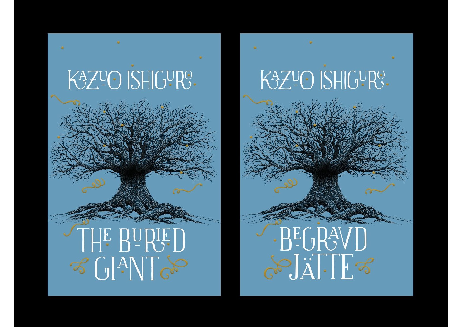
It’s common for the artwork of bestselling English-language authors to be acquired by the translation publishers, but for Nunes the reverse has been true. When Kazuo Ishiguro’s The Buried Giant [O gigante enterrado] was in production in 2015, it was first handled by one of Companhia’s trusted collaborators. But when they discovered the novel’s post-Roman Britain setting and understated elements of fantasy, a last minute change was needed and Nunes had an image in mind: “A tree seemed to have the strength of a giant, and an illustration by a Portuguese artist, Pedro de Kastro, that I had seen ten years ago came to my mind.” He only had three days but he acted quickly. To the finished image of the tree, Nunes decided to create the lettering again by hand and, as final touches, used golden hot stamping and a rough cover texture. It is an ornate design but one with small handcrafted imperfections and great imagination. Not long after it was published in Brazil, Vintage US purchased the rights to the cover for their paperback edition of the book. The rights have since been sold to Bonniers in Sweden. For Nunes, “the invitation to have such an important author’s cover used in other countries really was an unexpected surprise, I guess it is one of the most important moments in my career.”
In a market where designs for bestsellers follow very similar patterns, these covers show the importance of looking elsewhere.
Tristan Kendrick works in the Foreign Rights Department at Rogers, Coleridge and White Literary Agency, London.
*****
Read More About Illustration: