Illustrator Samuel Hickson is our guest artist for the October issue. His meticulous and haunting images, often composed out of thousands of small dots, bring to life eleven of our texts in the Fiction, Nonfiction, Drama, and Multilingual Writing feature sections. I interview him about his influences and his experience contributing to Asymptote.
***
Berny Tan: Your work is usually inspired by “satire, horror, sci-fi and psychedelia,” but not all of the texts you illustrated belonged in these genres. How did you generate ideas for those texts?
Samuel Hickson: Most of the texts featured details or events which immediately conjured images in my mind as I read them. I’d sketch these initial ideas down and then develop the image which portrayed the overall atmosphere or emotion of the text in the most succinct manner.
BT: Could you talk more specifically about what—or who—are the biggest influences on your work?
SH: Here is a quick list of some of my favourite artists/illustrators—Robert Crumb, Will Eisner, Hannes Bok, William Hogarth, Raymond Pettibon, Hieronymus Bosch, Francis Bacon, Wyndham Lewis, Laura Oldfield Ford, and Ralph Steadman. I respond to their work because they all create visceral, socially conscious images that mirror our reality in savage and strange ways. I think it is important to spend time studying a broad spectrum of artistic disciplines—“highbrow,” “lowbrow,” and everything in-between, in order to see the full picture.
BT: One of the unique aspects of your style is the use of pointillism, which is a very time-consuming technique. How and why did you develop this practice?
SH: I can remember attempting to recreate a version of Leonardo da Vinci’s Profile of a Warrior in Helmet from a grainy photocopy in high school. Due to the high contrast of the photocopy, I found that building up layers of dots using a pen seemed like the best way to replicate the image. I was very pleased with the final result and I received a lot of praise for it. The repetitive process became a form of cathartic meditation, and I find that listening to music as I draw puts me in a trance-like state which I find calming. I have recently been mixing this style with other mark making and digital techniques in order to create more versatile and contemporary looking works.

From ‘Rumor of Days to Come’
BT: We went through a long process of intense revisions for the issue’s cover. You came up with a lot of ideas and sketches before we settled on the haunting final design, a moon and the reflection of moonlight in the water. What was that experience like for you?
SH: I find repeatedly revisiting work quite frustrating. However, it can sometimes be necessary in order to achieve an impressive final outcome. Developing an initial concept that is solid enough is often more difficult than the actual execution of the piece.
BT: I really loved your illustrations for ‘The Trace in the Bones‘ and ‘The Time Traveller.’ Out of the eleven texts that you illustrated for us, which text did you most enjoy reading, and which image did you most enjoy creating?
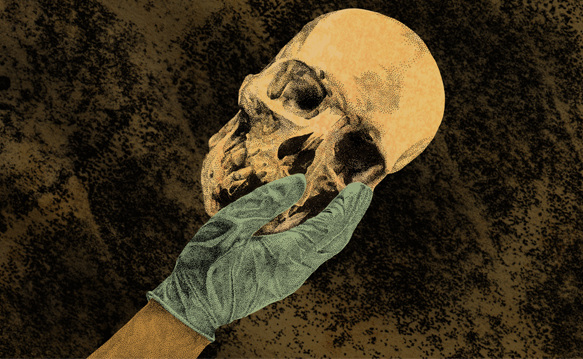
From ‘The Trace in the Bones’
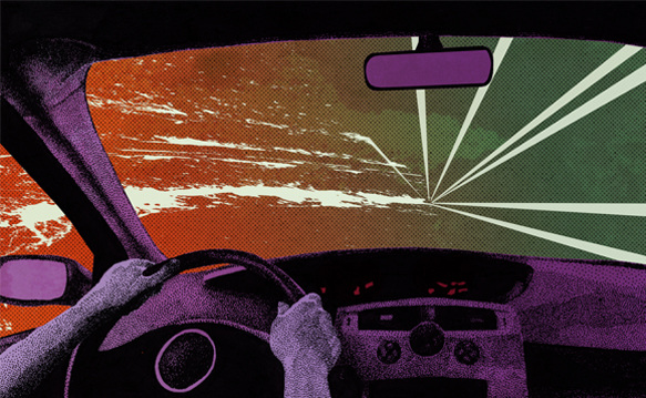
From ‘The Time Traveller’
SH: All of the texts were thought provoking and enlightening. I think Asymptote is a great platform for people from all over the globe to discover texts that might usually be outside their sphere of interest. I enjoyed reading the nonfiction texts the most, because they shed light on events which I had little or no knowledge about. ‘The Trace in the Bones’ by Leila Guerriero was a particularly harrowing article as I felt much admiration for the team of students who had volunteered for a thankless yet profoundly necessary task. It gave a fascinating insight into the atrocities of the Argentinian de facto government that had a deep emotional resonance.
BT: What are some of the challenges you faced in distilling entire texts into one image?
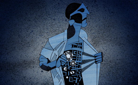
SH: The texts which used a more introverted viewpoint—such as Henri Roorda van Eysinga’s ‘My Suicide’—proved to be difficult. I had to create imagery that represented complex inner emotions and thoughts, forcing me to think in a more metaphorical sense to develop ideas. ‘The One Place‘ by Thomas Stang featured a scope so vast that I had to draw out as many details from the text as possible and then select the most relevant idea from the countless thumbnails. Eventually I settled on the griot image because I felt it encompassed the idea of myriad stories being channeled through one man in the same way the author had composed a text of rich detail from various events.
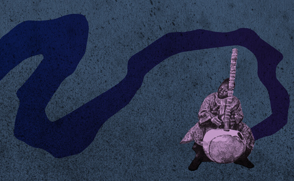
From ‘The One Place’
BT: What projects do you have planned for the near future?
SH: This is an exciting time for me because I am moving in a positive direction and should be able to find professional work after a couple of frustrating years. Trying to balance this ambition with an unrelated full-time job can be exhausting. I think that, very slowly, I am developing a solid portfolio which will enable me to gain commissions. I am also planning a series of more personal drawings, inspired by the horror and psychedelic genres which I have loved since I was a child.
From ‘My Suicide’
*****
Samuel Hickson is an award-winning freelance illustrator based in Manchester, United Kingdom. He combines highly detailed hand drawings with digital collage techniques, inspired by satire, horror, sci-fi and psychedelia. His website can be found here.
Berny Tan is Asymptote’s Lead Graphic Designer. An artist, curator, and writer, she graduated from the School of Visual Arts in New York with a BFA (Hons) in Visual & Critical Studies. Berny was born and raised in Singapore, and currently works as Assistant Curator for OH! Open House, a non-profit that explores Singapore’s cultural geography through art. Her website can be found here.
Read more interviews: